Website layout examples for your multilingual website

Updated on
June 19, 2023
November 27, 2025
There’s more to creating a website than just choosing the right CMS platform and selecting the ‘slickest’ template.
Yes, how it simply looks has a big impact on how you’ll come across to your potential customers, but there’s a much bigger thought process behind it.
Your website layout contributes to the overall success of your site. It determines both the look and feel and how your users will navigate and interact on your pages. Which all adds to whether someone is more likely to purchase your product or service.
Interestingly, 38% of people will stop engaging with a website if the content/layout is unattractive. Good website layout goes further than just choosing a popular template design – it’s an integral part of website design.
And, so often with all industries, there will always be trends. Right now it’s fair to say that full bleed imagery and the three column design is up there as one of the most used layouts.
It may well be a recognizable format that brings familiarity to your website users, but, is following trends always the right way to go when online businesses have such varying target audiences?
Customization and creating a website layout that suits your target customer is always going to be crucial if you want to stand out in your market.
What makes a good website?
It’s not exactly an easy question to answer or quantify. There are many possibilities when it comes to web design.
Depending on the industry you’re in, your brand image and who your target audience is will all have a major impact on what can be considered a ‘good website’.
But there are some general elements that all businesses can benefit from.
- Simplicity. Use white space to break up content. Remove the ‘fluff’ and concentrate on what the user is really looking for.
- Navigation. Make it easy for your site user to get to pages of interest. It’s key to retaining visitors.
- Visual hierarchy. Establish a focal point on your site to show site visitors where the most important information on the page is. This can be in terms of arranging elements in order of size, colour, imagery, fonts etc.
- Color and imagery. The right use of colors and imagery can attract users to stay on your site longer. The wrong use can lead to distraction.
- Mobile compatibility. In case you need reminding, Google now indexes websites by the mobile version first. So, make sure you check how your site looks on the mobile version too.
- Multilingual. It’s no secret that in a world with ever growing connectivity that people are increasingly choosing to purchase goods from outside their home country. Offering a website in more than one language is an essential element for anyone wishing to grow their market share and increase their revenue streams.
Website layout examples for your multilingual website
As all internationally minded entrepreneurs know, a multilingual website is a must have when doing business online. We’ve got some great website layout examples from some of Weglot’s very own multilingual website customers.
So, what makes their website layouts so appealing?
Crabtree & Evelyn

Let’s kick things off with body and fragrance giant Crabtree & Evelyn which uses Weglot to make their ecommerce site truly international.
When you sell thousands of products online it can be difficult for your site visitor to focus on just one actionable CTA. Which is why this online retailer knows exactly how to stand out when it comes to its website layout.
They’ve created a full page above the fold key message that they can change depending on the season or country they’re targeting. And, as every ecommerce retailer knows, the biggest time of the year is naturally the holiday season, so it makes sense that they’re pushing what their buyers are undoubtedly looking for right now.
There’s no chance of a high bounce rate for this homepage. A clear CTA ‘shop now’ brings you straight to the product page of their gift sets – that’s some impressive, fast site navigation.

Taking a different approach to many online retailers, they’ve chosen to create a simple menu with two dropdown options and a search bar.

With the huge number of products they’re offering on their site, they give two options. Option 1 the ‘search bar’ has been created for the person that knows what they’re looking and the ‘shop’ option might be preferable for a new user who’s looking to see what products are available.
Scroll down the homepage and they’ve split their website layout into different rows offering more targeted items. Best sellers and additional gift sets again appeal to new users unsure of where to focus their search.
At the footer of their site they’ve chosen to customize their language switcher for the ultimate display of localization.

You’ve got the option to choose the country you’re in, plus the language you speak. As a brand that knows localization is key, they’ve recognized that not every person located in a particular country can speak the local language.
Digital Menta

Notice how this digital media agency uses white space, custom illustrations and clear call-to-actions to immediately grab the attention of the site visitor.
This website layout example is a clear demonstration of how the user has everything they need above the fold. Their visual hierarchy comes in the form of their tagline ‘revolutionary digital that matters’ – with a highlight on the last two words.

The simple addition of a ‘let’s talk’ button means the site visitor doesn’t need to look much further when it comes to taking an action. Choosing just two colours, grey and green as their accents, makes for more coherence and simplicity.
For most digital media agencies, social media is a major power tool when it comes to showcasing work and bringing clout to what they do. The use of a sticky social media bar on the right hand side of the site keeps their social media channels in sight.
Their navigation is straight to the point and it’s clear where you need to go for what information. Scroll further on their homepage and you’ll see their clever use of fonts and highlighted text keep the reader engaged with what matters.
When it comes to language switching, they’ve chosen to add their language switcher button in the footer (they’ve switched on the useful Weglot feature of directing users by their web browser).

Yogang

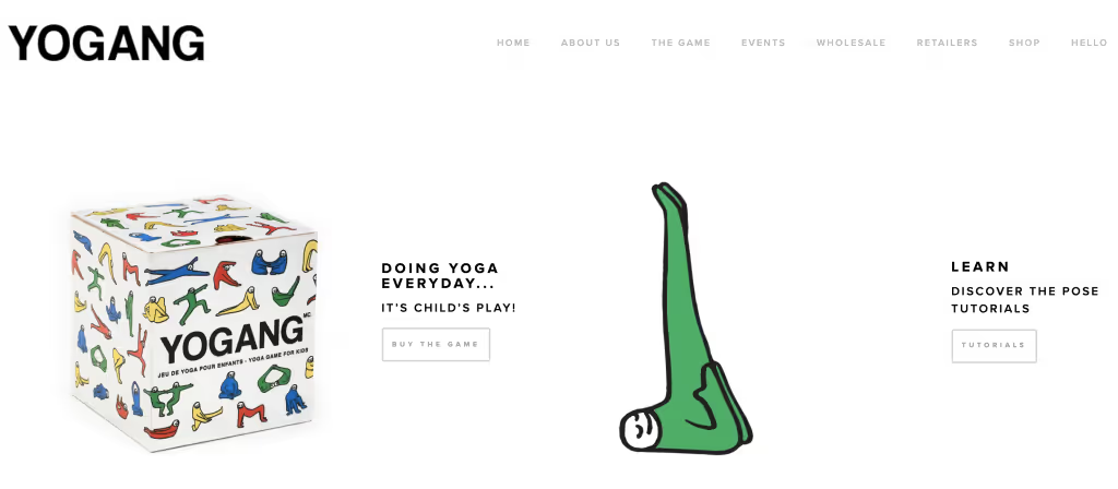
You know when we mentioned simplicity and removing the ‘fluff’ to create a website layout? Well this site example does just that. This yoga game for children showcases the perfect mix of animation and white space to create a sense of curiosity and intrigue – whilst the animation is not just there as a gimmick – it’s a clear indicator of what they’re all about.
Your first understanding of this brand is their clever cover page which features playful characters in various yoga moves. With a first impression like this, there’s no doubt that you’ll want to go further into the site.

Move past their creative cover page and you’ll find yourself on their main website. Again, the playful characters are used throughout the website design to give consistency, with their main product showcased as soon as you land on the homepage.
There’s a clear CTA so you can purchase the game, plus the option to understand more about the product on the right hand side. Two CTAs for both the impulse buyer and a buyer persona that first needs more clarification.

They’ve made an albeit lengthy menu bar, but in this case they have every reason to. With the option to sell B2B and B2C, it makes sense for users to find exactly what they want immediately.
Their product sells in both French and English markets, so a subtle Weglot language switcher on the bottom right of their site gives the option for instant site localization.
Navy or Grey

This tailoring company Navy or Grey has mixed white space, illustrations and their USP in the first fold of the website. Sophistication is the best way to describe this site’s look and feel, which pairs well with the industry they’re in.
And, when it comes to visual hierarchy, they’ve got this ticked off the list. The first fold of the site draws the eye to just two elements, image and text.
Their easy to navigate menu allows you to understand their sales process without offering too many options. Scroll further on their homepage and you’ll find images that showcase further how this company works.

And, top marks for splitting their products into two separate menu items ‘shirts’ and ‘suits’. It allows the users to get to what they want without having to navigate through subpages.
When it comes to multilingual, their language switcher sits on the top right of their site – blending in with the look and feel of the design perfectly.
And in terms of offering multilingual ecommerce, they’ve made it easy for both their Dutch and English clients to use the payment method of their choice with no less than 9 different options.
Create the right website layout for your user
When creating your website, always keep your target user in mind. Website visitors want to get to the information they need instantly. Don’t make it harder for them than it needs to be.
The website layout examples shown above know exactly what their users want and it shows.
What can we learn from them when it comes to website layout? Put your CTAs in the first fold of your website to maximise your conversion rate, use white space to highlight your message and always ensure your menu navigation is as simple as possible.
Interested in translating your website? Try Weglot on your site with our 10 day free trial.
Want more? Read: 9 Tips for Designing a Multi Language Website, Multilingualympics: Here’s to the multi-language websites doing it right, 6 Types of Businesses That Should Definitely Translate Their Website
In this article, we're going to look into:
Ready to get started?
The best way to understand the power of Weglot is to see it for yourself. Test it for free and without any engagement.
A demo website is available in your dashboard if you’re not ready to connect your website yet.
Read articles you may also like
No items found.
Common questions
No items found.


