Try Weglot for free


If international visitors can’t find your content in a language they understand, you’re effectively blocking the path to engagement. For website owners, this is frustrating. You invest in multilingual content, but if the switcher is hidden or poorly placed, international visitors may bounce off your site.
Fortunately, this is really easy to overcome with the addition and proper placement of a language switcher. Allowing a user to view your site in whatever language they choose, regardless of what country they are in, kickstarts your customer experience and builds trust from the moment they land on your site.
Studies show that optimizing the user experience can increase conversion rates by up to 39%. A failure to do so drives lost opportunities, so it pays to attend to those granular details. Take on board our best practices for language switcher placement, design, and implementation to guarantee a warm site welcome for all.
Many websites lose international users due to language switchers that are hard to find, poorly labeled, or unusable on mobile. Tools that let users choose their preferred language become pointless without optimization, frustrating visitors and undermining the value of your content. Be mindful of the following to avoid the most common pitfalls and create an engaging experience for every user.
Nielsen Norman Group research shows that users expect language options in predictable spots, like the top right or within obvious menus. What’s more, clear labeling – such as native language names, icons, and flags – increases discoverability and trust.
Ecommerce sites benefit from header placement. For blogs or corporate sites, consider the main navigation or sidebar for visibility without clutter.
While footer placement can make a site look neater, it often leads to missed opportunities, especially on long or scroll-heavy pages. Consistent placement across all pages is essential – users shouldn’t have to relearn your site’s structure as they navigate.
Prioritize discoverability over minimalism and make the switcher a predictable (but never annoying) element of your website.
Consider political and cultural sensitivities if using flag icons for languages. Flags represent countries, not languages, and can alienate users in multilingual nations or regions with complex identities.
On the contrary, text-only switchers can also be problematic if users can’t read the default language. Display language names in their native form (e.g. Deutsch for German), and consider pairing text with universally recognized icons like a globe.
Ensure high color contrast and clear visual cues so the switcher stands out, regardless of background or theme. Dropdown menus with too many options can overwhelm users, so prioritize the most relevant languages. What looks ‘clickable’ varies between cultures, and colors and shapes can influence findability, so test your design with diverse audiences.
Desktop language switcher designs often fail on mobile due to small touch targets and poor placement. Limited screen space means users may never see a switcher buried at the top or in a crowded menu.
Prioritize thumb-friendly zones. Accordion-style selectors or floating buttons can improve usability, making it easy to switch languages without extra scrolling.
Responsive solutions like Weglot’s switcher automatically adapt to device sizes, ensuring clear, accessible options on any screen. Let’s take a look at how easy it is to add a customizable switcher to your site using our translation tool.
{{quote-cta-banner}}
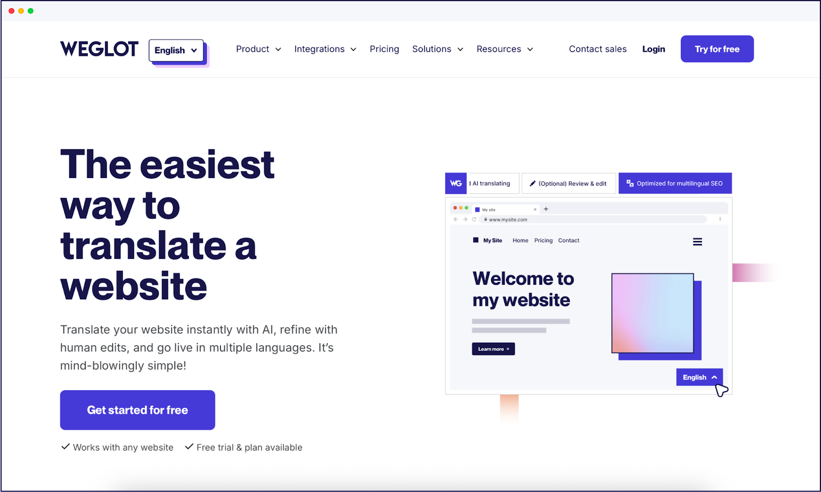
Adding a language switcher with Weglot is fast and straightforward. Once installed, our tool instantly adds a customizable language switcher to your site, with no coding required. You can choose from over 110 languages, tailor the design, and position the switcher for maximum engagement. Implementation takes minutes, not days!
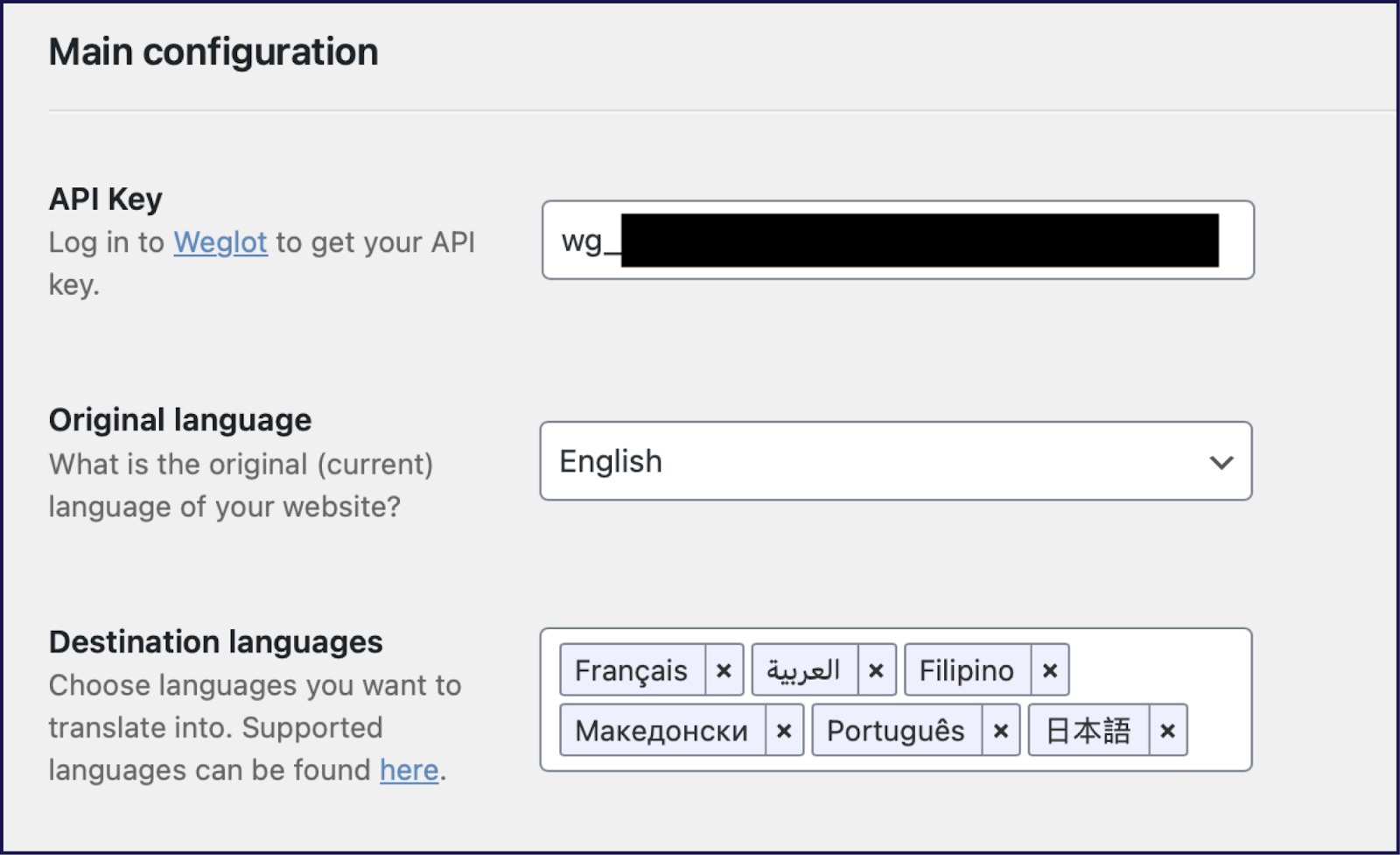
Weglot’s setup is designed for speed and simplicity and it works with all Content Management Platforms (CMS). After creating a Weglot account, install the Weglot plugin (for WordPress) or follow Weglot’s simple onboarding (for other platforms like Wix, Ghost, or Webflow).
Enter your API key, select your site’s original language, and choose your target languages. Weglot automatically detects your website content, translates it, and adds a language switcher to the front-end, usually at the bottom right by default.
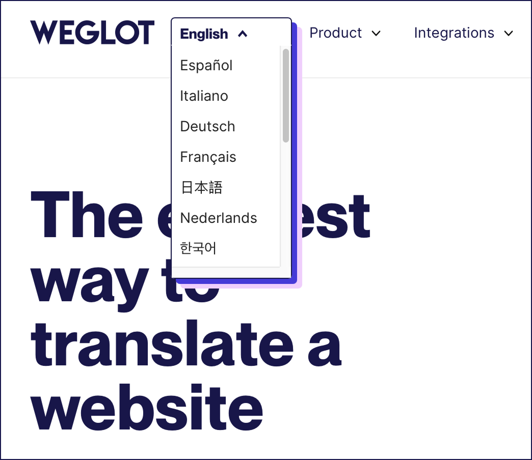
The language switcher works instantly, letting visitors switch languages with a single click. You can then edit translations or further personalize the switcher through your Weglot dashboard.
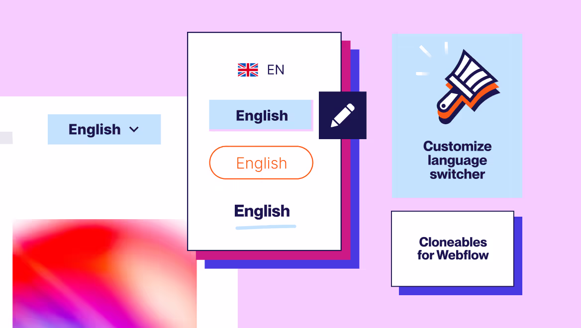
Weglot offers extensive customization for your language switcher:
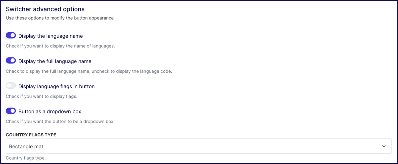
The switcher is fully responsive, adapting to mobile and desktop layouts for a first-class user experience. For advanced needs, reference the Weglot API documentation to create unique switcher designs or integrate with custom site elements.
There is of course considerably more to our translation tool than a premium language switcher! Weglot can transform your site into a multilingual one with quality translations in just a few minutes.
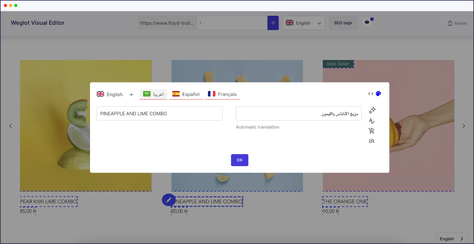
Weglot’s AI-powered translations and AI Language Model deliver instant results, while human editing tools ensure accuracy and nuance. Take a look at our Visual Editor below – this enables front-end editing to ensure different language text fits your existing designs:
The platform also manages all technical SEO details, including language-specific URLs, translated metadata, and hreflang tags, so your site is discoverable in every market. Here’s an example of a tag that stipulates the Spanish language:
<pre>
<code>
<link rel=“alternate” hreflang=“es” href=“https://example.com/es/“ />
</code>
</pre>HTML language example
By handling hreflang tags, Weglot makes browsing even more convenient for international users than having a language switcher alone. These tags are highly important HTML attributes that signal to search engines which language and regional version of a page to show, ensuring visitors see content in their local language.
Correct tagging also prevents duplicate content issues and helps search engines correctly index translated pages, improving international search in relevant markets. Should browsers have a different language preference to the one served, they can then use the switcher to change it.
A well-placed and thoughtfully designed language switcher plays an important role in making your website multilingual. It serves as the gateway for visitors to access your translated content, directly influencing user engagement and conversion rates.
No matter how accurate your translations are, they only add value if users can find them. With Weglot in your tech stack, you get a no-code solution that delivers high-quality translations and ensures your language switcher is integrated and easy to navigate.
By treating your language switcher as the front door to your global brand experience, you create a more inclusive experience for every visitor. Try Weglot free for 14 days and make your multilingual website more accessible than ever.

We’ll get your first languages live. You decide how far you want to go. Try Weglot for free today.
Trusted by 70,000+ global brands


Get started for free and have a multilingual website up and running in minutes.


Weglot is tested and trusted by brands worldwide since 2016. Join them today.


The best way to understand the power of Weglot is to see it for yourself. Test it for free and without any engagement.
A demo website is available in your dashboard if you’re not ready to connect your website yet.