5 tips for ecommerce web design

Human beings are quite simple — we like things that look nice. You can have an amazing product, great prices, and multiple language options, but the design of your website will still be the first thing most of your customers judge your brand by.

But the good news is that you can easily have an ecommerce website that creates a positive first impression, reinforces credibility, and turns your visitors into customers with some design adjustments.
So in this article, I’ll share 5 very important design tips for ecommerce websites and I’ll even sneak in some additional tips for those selling internationally with a multilingual website!
Tip 1: Take Advantage of the Visual Hierarchy
Okay, let’s start by learning a fancy design term to get you in the mood — the visual hierarchy. It’s actually a simple concept; the arrangement, size, color, and contrast of visual elements determine their relative prominence and the order in which they are seen by the human eye.

However, this simple concept is crucial when it comes to designing your ecommerce website. Why? Because not all elements on your page have the same importance, and seeing them in different orders can have a different impact on your visitors.
This is where visual hierarchy comes into play and gives you control over what your visitors see first. By combining these elements (the size, position, format, position relative to other elements) you can emphasize what’s important and arrange the path that follows.
When you use the visual hierarchy on your ecommerce website strategically, you can guide a visitor’s attention from interest to conversion. So instead of determining sizes, positions, and colors randomly, be aware of the effect you’re creating (check the table above) and use it to your advantage.

If you’d like to dig deeper into the visual hierarchy principles, check out this article.
Multilingual tip: With visual hierarchy, you can create the optimal impact for different markets. For example, for a certain international audience, the price can be the most important factor, for another, it can be free delivery.
Determine which factors would create the most effective path to conversion and use the visual hierarchy accordingly for different international markets.
Tip 2: Use Images with People
American software company Basecamp did some testing on the Highrise marketing site to see what type of website design can increase the paid signups and they got some interesting insights. Their a/b testing proved that using images of people increases conversions.

This makes sense because the human brain is programmed to recognize and interpret other faces. So you have better chances of catching the attention of your visitors by using images of people on your ecommerce website.
But it doesn’t end there. The person in the image and their facial expressions also play a big role in shaping viewers’ perceptions. For example, according to Basecamp, the success behind the design shown above was the fact that the model looked friendly, very non-techie, and approachable.

So you can create a feeling of familiarity by using models that reflect the features of your target audience. Similarly, you can evoke positive emotions and trust with certain facial expressions like happiness and contentment.
Multilingual tip: Using images of people on your multilingual website can help you build an instant connection with your international customers. For example, Clarins localizes its imagery based on the country it’s targeting, using European women on their French website, whereas on the Korean website it’s Korean women.
In addition, this localization practice can also help you avoid potential offenses. Check our article to learn more about multilingual design considerations!
Tip 3: Include Social proof
Is there anything more reassuring than reading a positive review about a brand or product you’re interested in? It’s so effective that 92% of consumers are more likely to trust recommendations than any other type of advertising.
So why not use it to your advantage? Instead of just talking about how amazing your brand is or how useful your products are, prove it with reviews.

Here are some different types of social proof that you can use on your website:
- Reviews from customers
- Case studies
- Number of users
- Logos of big customers
- Association memberships, security certificates, and awards
- Social media widgets showing the size of your following

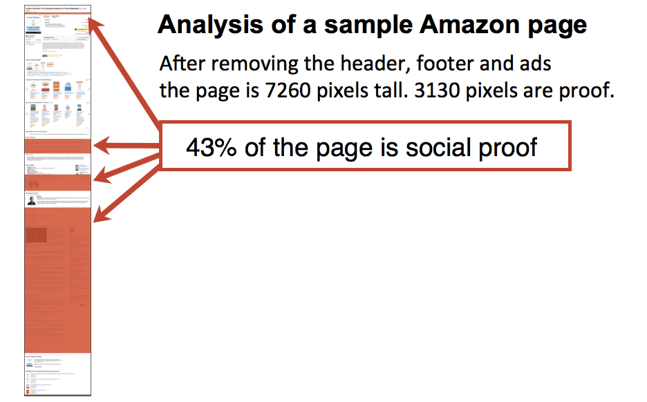
And how many reviews should you include? Well, when it comes to social proof, the more the merrier! According to Orbit Media’s analysis, 43% of Amazon’s product detail pages consist of social evidence and reviews. So if the ecommerce giant Amazon is doing it, it must work (you see what I did there?).

At this point you might be thinking, if it’s so effective, why not create a separate page dedicated to testimonials?
Although it might seem like a good idea, testimonial pages tend to be low traffic pages. Therefore the best practice is to integrate them into your high traffic pages such as your homepage and product pages. This way you can ensure that the social proof will support and enhance your content throughout your website.
Multilingual tip: Social proof is particularly important for multilingual websites! Customers might need that extra reassurance when they are shopping from overseas. So reviews from your domestic market can help convert international visitors.
Therefore, make sure that everyone can understand the social proof on your website by translating them. You can learn how to translate your Yotpo reviews with Weglot.
Tip 4: Make it Long
How long is too long when it comes to web page length? Apparently, you can’t go wrong with long pages. In Crazy Egg’s famous case study, extending the page length by x20, resulted in conversions going up by 30%! Here is a visual to show you how drastic of a change that is!

This might come as a surprise knowing that our attention span is shorter than ever thanks to 15-second TikTok videos and 140-character tweets. But when it comes to websites, research shows that visitors prefer scrolling over clicking.

According to the Nielsen Norman Group, people learned and got used to scrolling, thanks to the long web pages of the 90s and this digital habit still lives on today. Therefore, scrolling feels automatic and easy, whereas clicking requires extra action.
But this doesn’t mean you have to fill your pages with irrelevant information to make them longer. Longer pages give you the opportunity to have more sections, white space, and visuals. So, use it to make your content visually appealing and easily digestible.
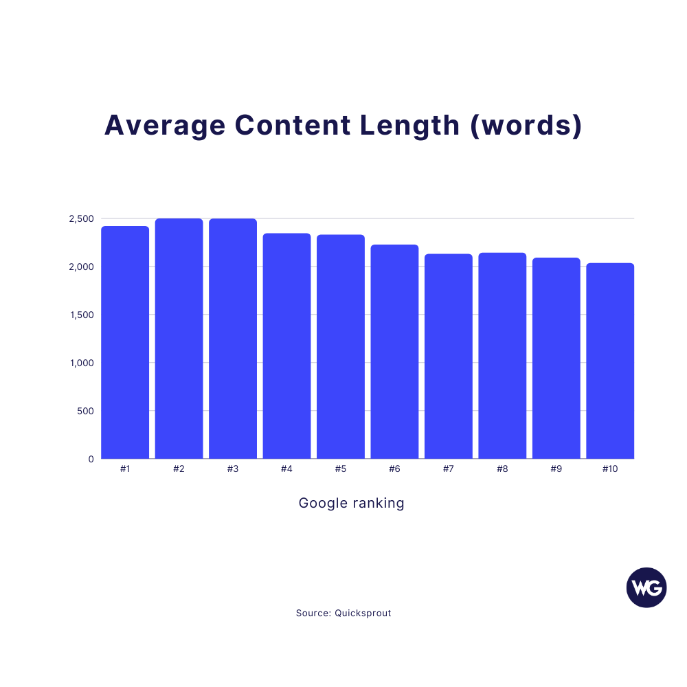
And visitors aren’t the only ones who love long pages. According to research, Google favors longer content. SerpIQ did a study where they analyzed the top 10 search results for over 20,000 keywords. The results showed that all of the top 10 results had more than 2,000 words and the higher-ranking pages had more content.

And moreover, longer content seems to get more backlinks as people are more likely to link to in-depth content. This combined with the longer sessions makes long pages more SEO-friendly.
Multilingual tip: Different languages take up different amounts of space, therefore you might need to adjust your content on your translated pages. Longer pages are beneficial in that sense as they provide more space for design modifications.
Also, make sure to follow the best multilingual SEO practices to ensure that your long pages improve your rankings in international markets too.
Tip 5: Avoid Carousels
High quality and detailed product images are crucial for a successful ecommerce website — everyone knows that. However, you might not know that the way you display those images is also quite important.
Carousels — multiple images that can be displayed in a single space by rotating left and right — are a popular ecommerce design choice as it’s a practical solution for showing multiple product images. Even though it might seem like a good idea to use them on your website, research suggests otherwise.

According to Neil Patel, 9 out of 10 times, carousels decrease conversion rates. But what is the problem with carousels? Well, turns out most people don’t click to see the following images so they are left unseen.
In fact, a study by Notre Dame University web developer Erik Runyon showed that among the 3,755,297 people who visited their homepage, only 1% clicked on an item in the carousel.
What’s even more depressing is that 84% of those clicks were on the first item in the rotation. He later tested carousels on other types of websites to see if more targeted content would improve things but the highest CTR he achieved was still 8.8% — not so promising.
It’s also not a great practice regarding accessibility. Carousels are usually controlled with arrows or small bullets which makes it hard for visually impaired visitors to navigate. So if you don’t want to alienate some of your visitors, avoid using carousels.
But how else should you display your images? Try stacking images so that visitors can easily see all of them by simply scrolling through — people like that, remember? Or you can opt for a fancier option that’s called Smart Content that creates a personalized experience for each visitor based on their interests or previous actions on the site and displays the most relevant images.
Multilingual tip: To make sure that your images are effective in converting international visitors, in addition to avoiding carousels, avoid un-translated text on your images as well. Having an image with a text that your international visitors can’t make sense of is sure to decrease your click-through rate.
You can easily translate your images and provide a truly localized user experience with Weglot’s media translation feature.
Wrapping Up
This was it for our best ecommerce web design tips! Let’s have a quick recap:
- Understand the visual hierarchy and use it to your advantage.
- Prioritize images with people in them. Beware that the person in the image is important regarding the message you’re trying to convey.
- Social proof is an effective tool for converting visitors into customers. However, integrate them throughout your website instead of having a dedicated testimonials page.
- Try to make your pages longer with useful and easily readable content.
- Avoid carousels and prefer more user-friendly ways of displaying multiple images.
If you have a multilingual website, don’t forget to take the multilingual tips into account as well! If you don’t have a multilingual website yet, let’s change that today with a 10-day trial of Weglot!


